
A few months ago, my friend and wildly talented photographer, Scott Goldsmith called and asked if I would be willing to work on a pro-bono logo project that involved the Pittsburgh Police, the Pittsburgh Steelers, children, and chess.
Read MoreYBG and a Spring Jubilee
Spring is a really great time for yellow based green and for YellowBasedGreen. Suddenly, there are things to look at outside the office window besides that fake Adirondack plastic chair that keeps trying to leap to its death into the empty fire pit. There are actual fresh sprouts and buds and tiny leaves and things. Steve the cat needs to come inside and outside and and inside and outside 300 times a day vs. his typical winter schedule of 134 times a day. And it’s so much easier to incorporate my signature hue into designs. Take for instance, this poster for The Friends of Bayne Library Spring Jubilee. Did the book need to be that color? Probably not. Does it look amazing in that color. It sure does. Am I going to get my bum out of my office chair and attend this delicious event for a great cause at Revival on Lincoln? You bet I am. Because spring has sprung.

Dog Blog
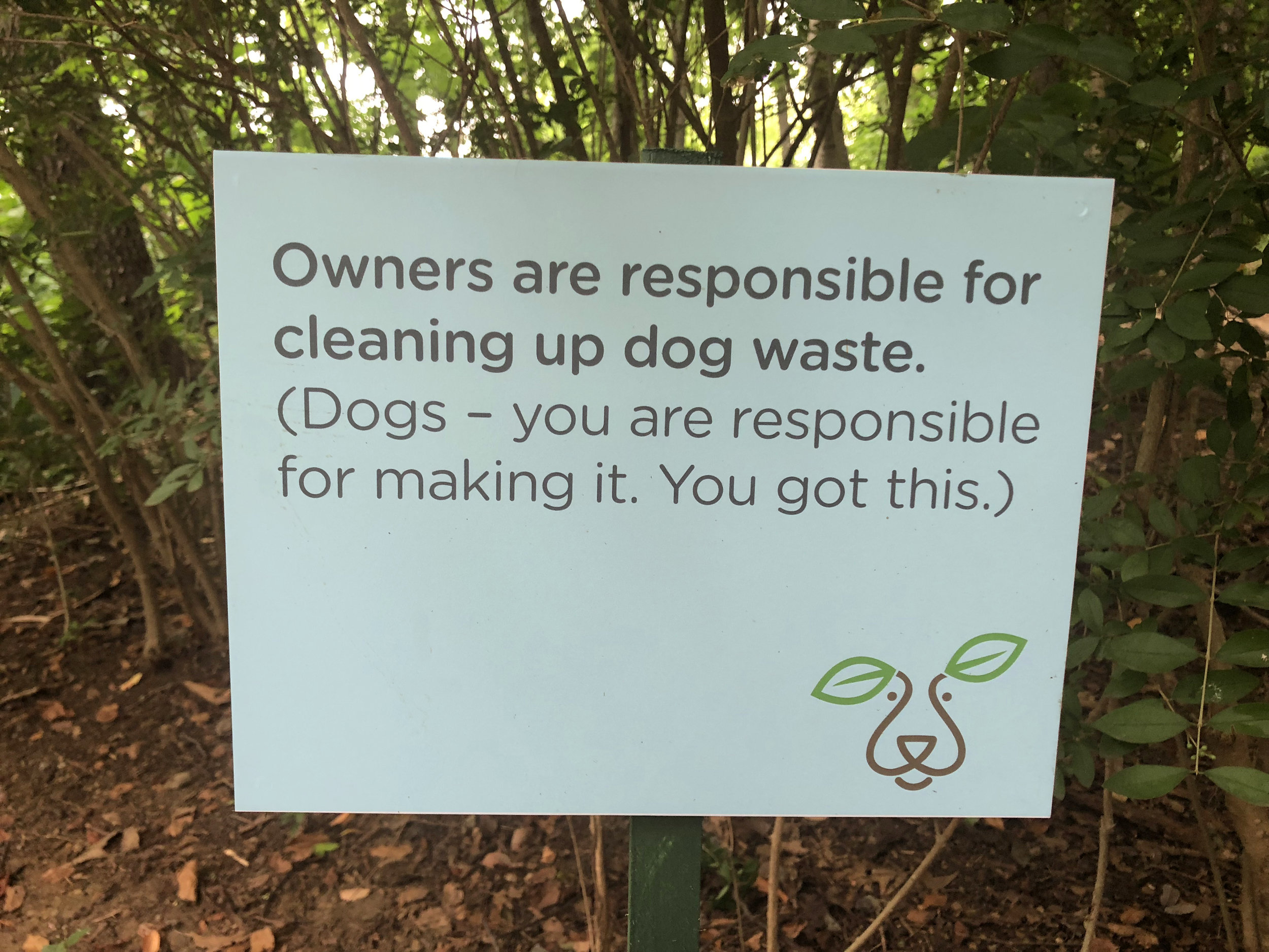
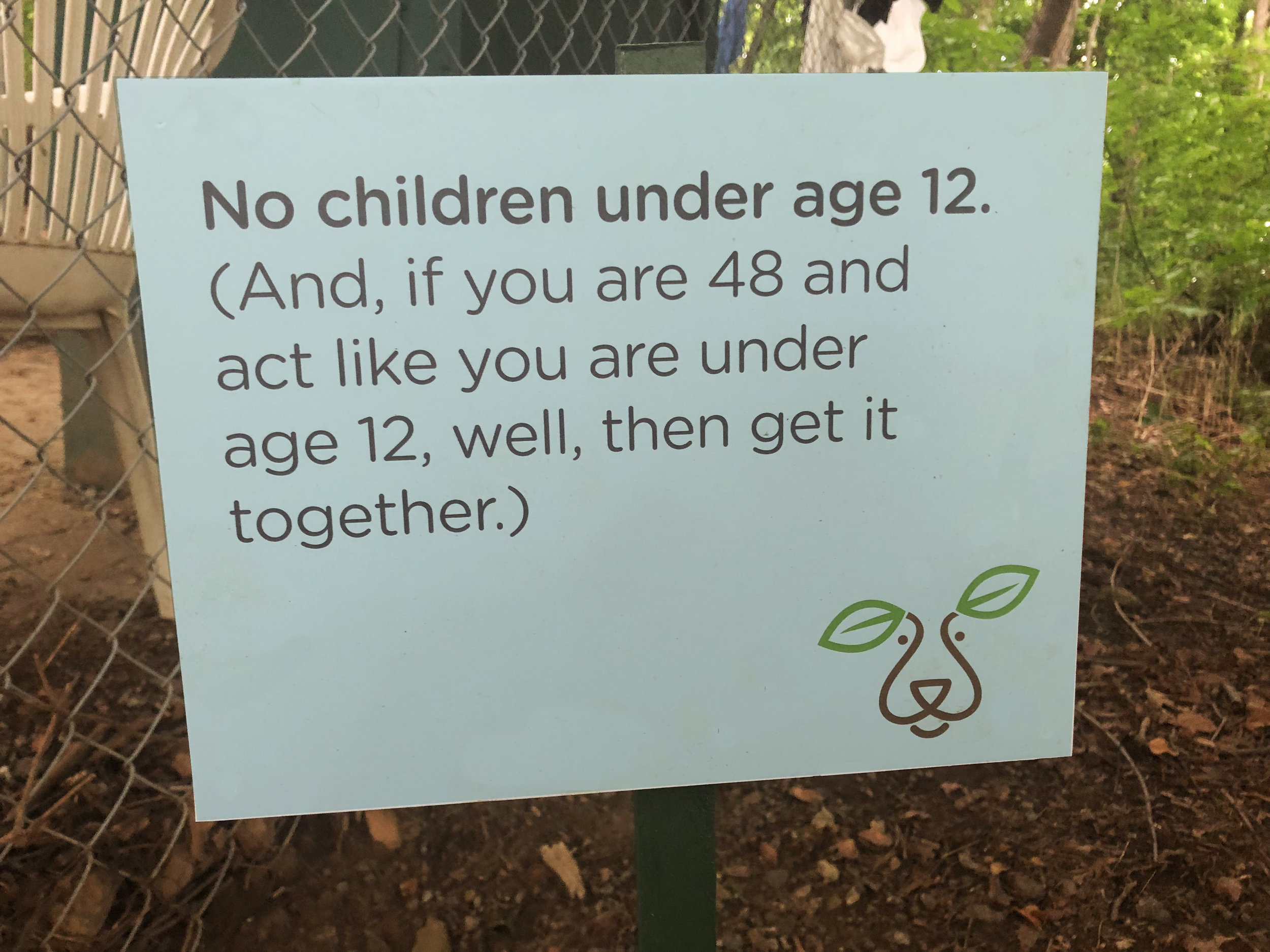
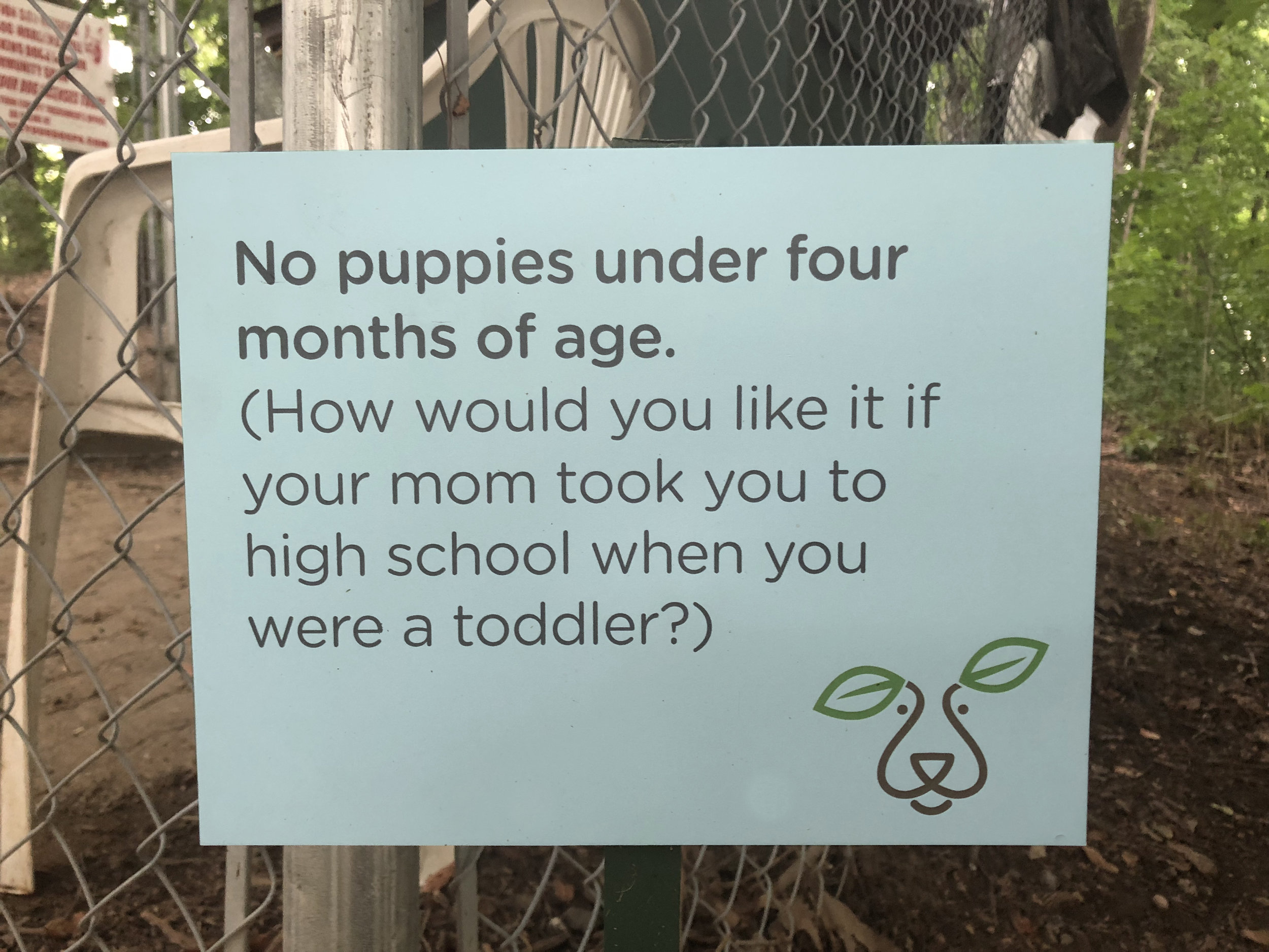
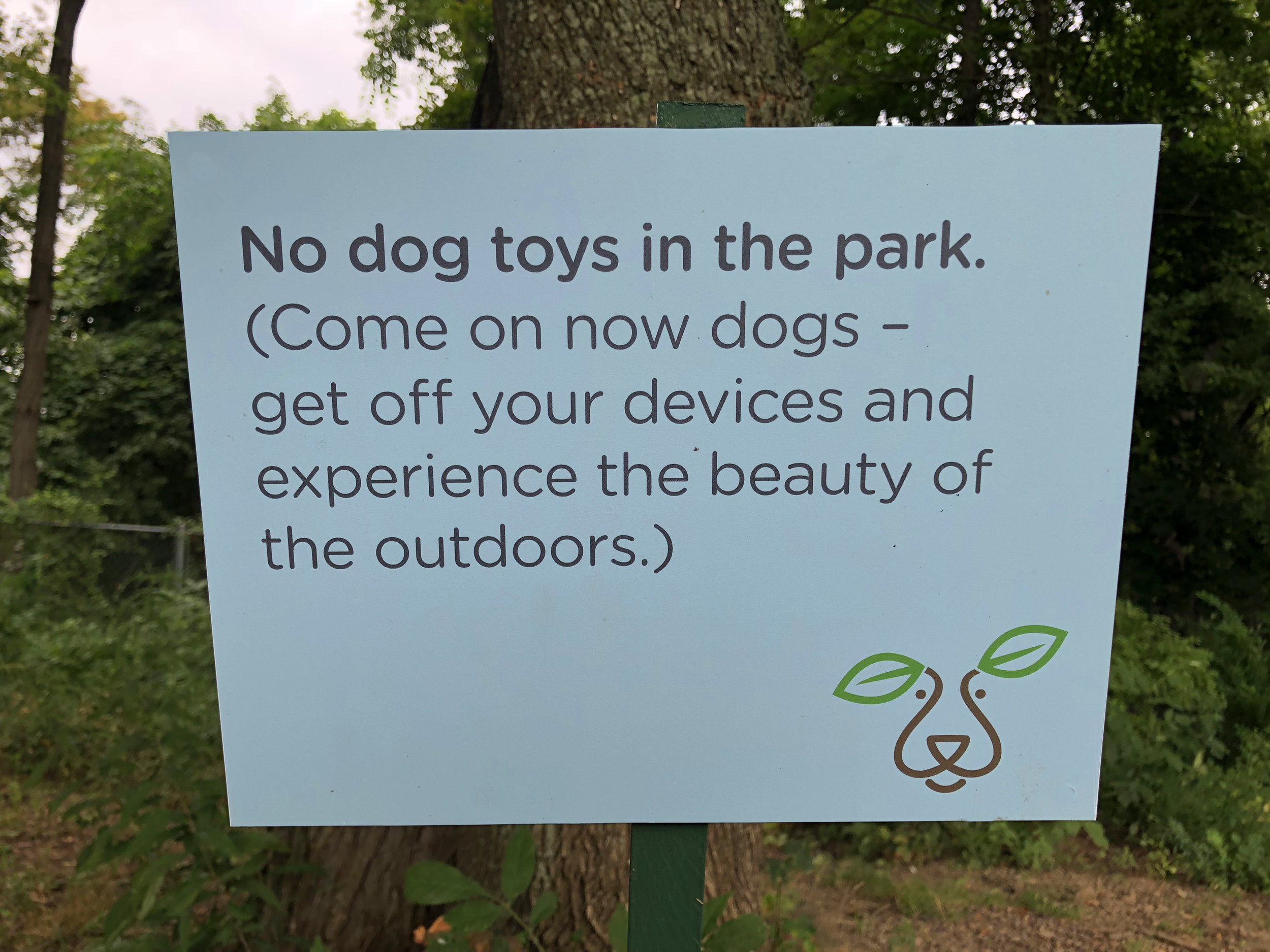
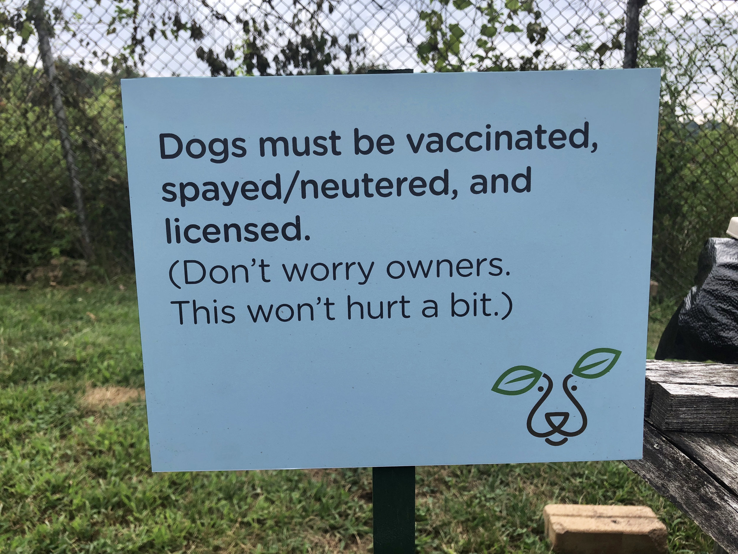
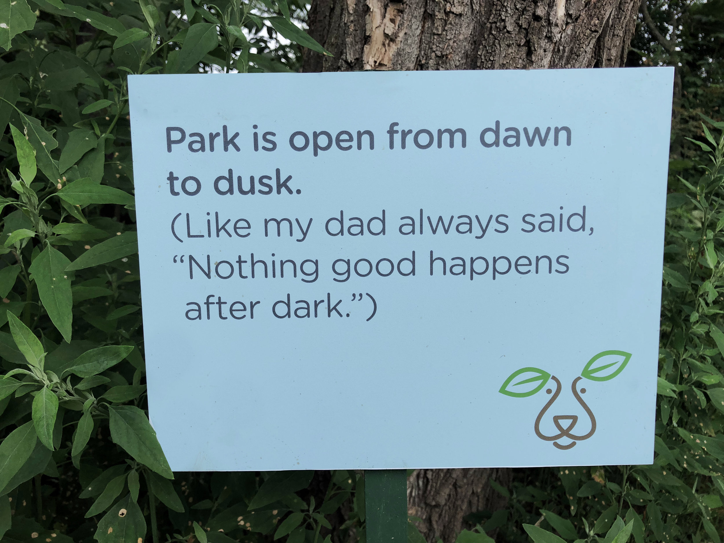
We have always been a cat family. Since we got our dog, Max, a year and a half ago, we have been introduced to the wide (and sometimes wacky) world of pups and their humans. The first time we took Max to a dog park, we were totally unprepared for the mass canine greeting we got and the cast of characters, both four and two-legged. I mean, in the 70's, we just opened the door, let the dog out, and hoped for the best. This dog-park concept and the pup-freedom it provides, was something I never gave a lot of thought, pre-Max. So, when I was asked to create a logo and signage for the Bellevue Dog Woods, I was pretty excited. This is the only logo I presented. It illustrates the intersection of "dog" and "woods" and it's inspired by Max's expressive ears. I also had some fun with small rules signs that are scattered around the park as friendly reminders. Check out the Dog Woods in person or on Facebook.
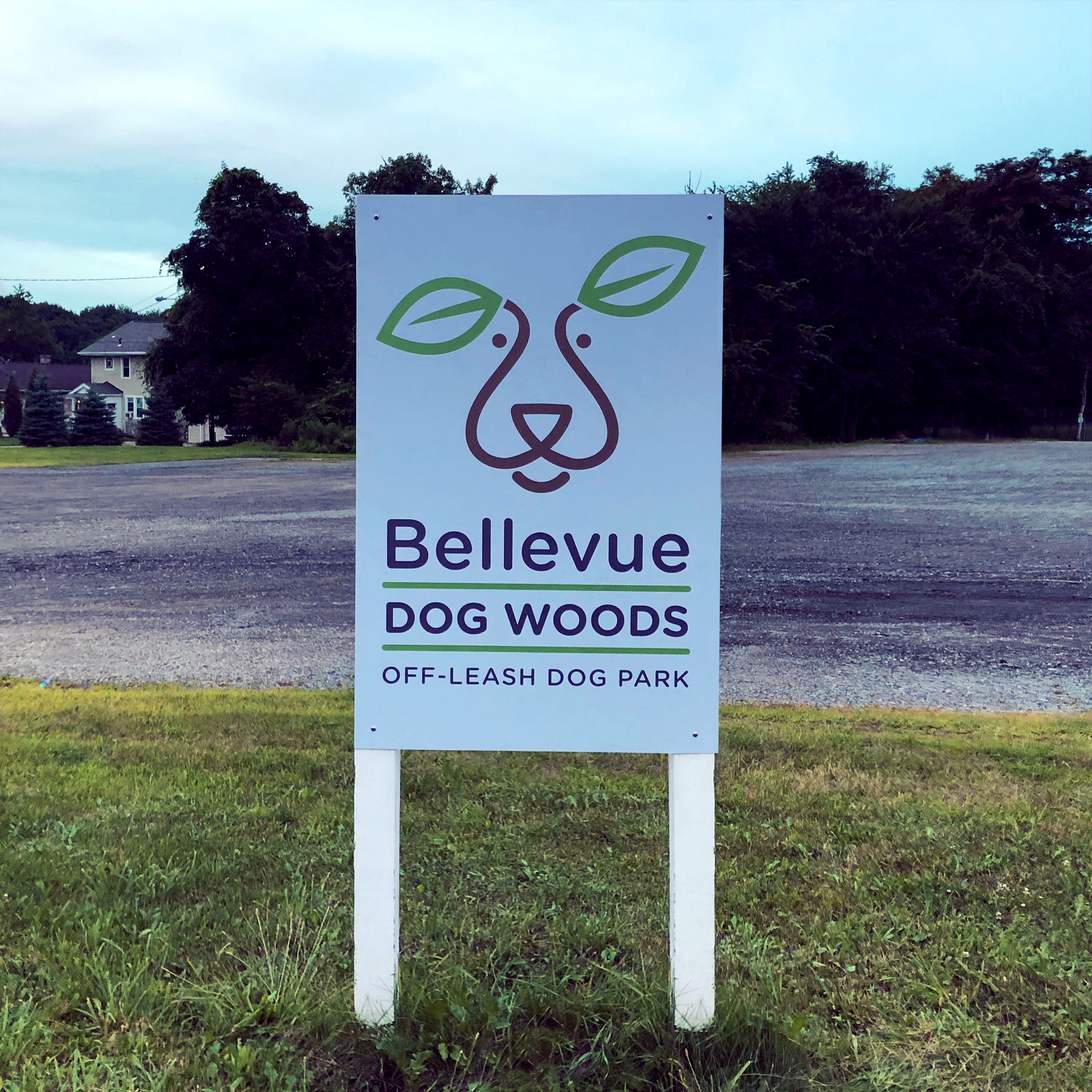
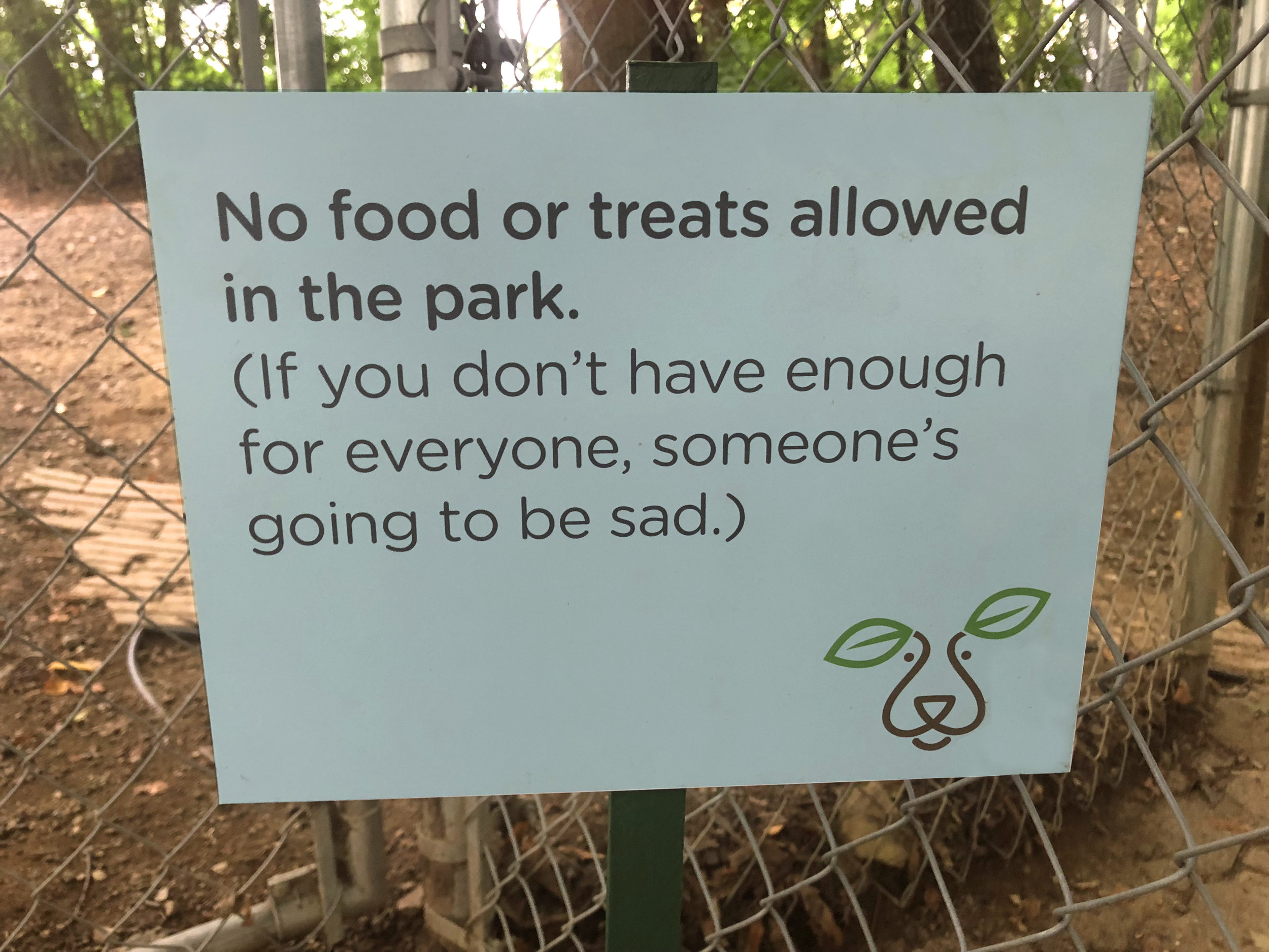

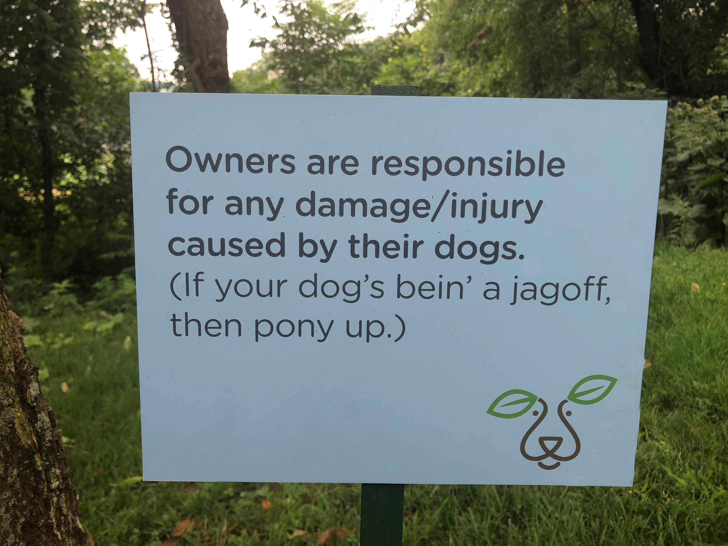
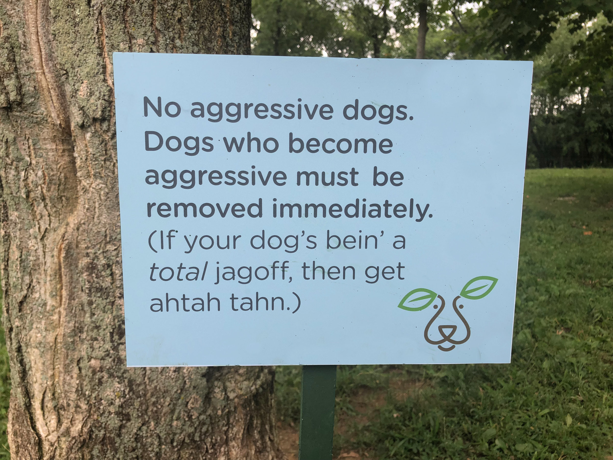
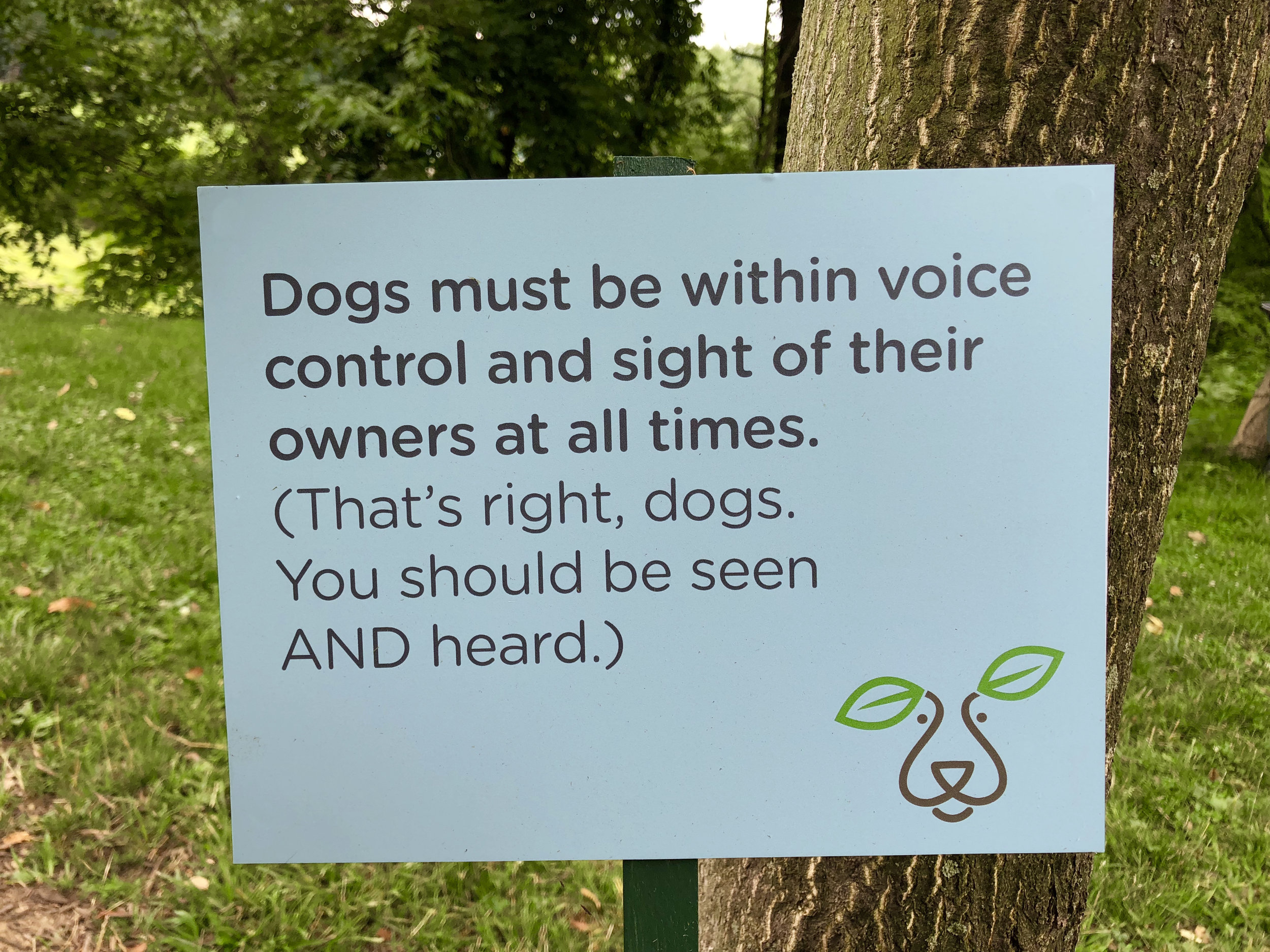
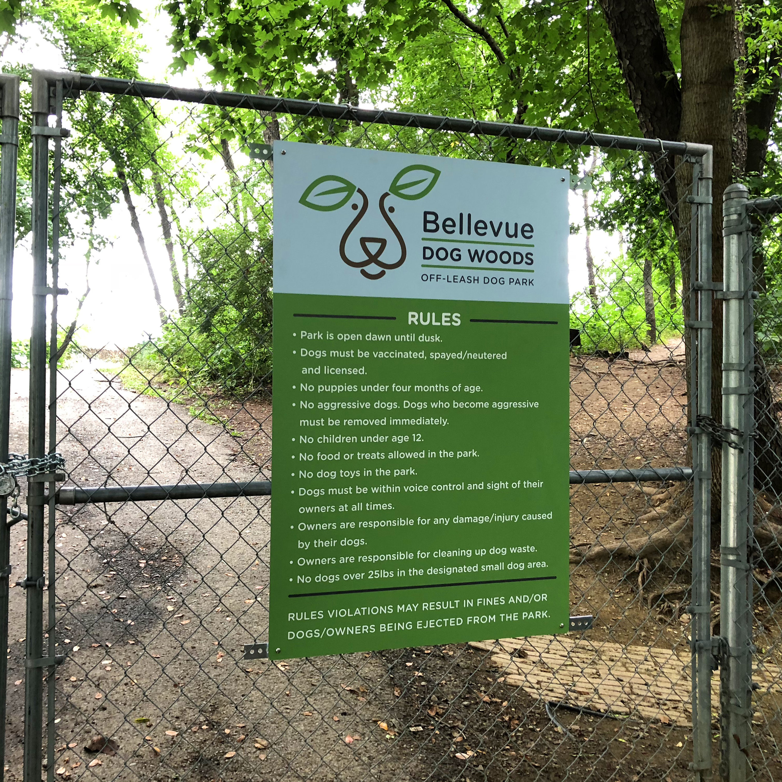

Thanks to Print Management for the signs.
MOVE OVER PHILIPPE STARCK
Last year, the principal of my daughters' elementary school asked me if I would be interested in designing a maker space. I could not stress to him enough that I am not an interior designer, but he seemed to feel I was up for the job. He gave me a tour of an old conference room that would be turned into a creative K-6 work space (did I mention I am not an interior designer?) and it was certainly a blank canvas.

Blank canvas.
Because I am strangely driven by fear, yet love a challenge, I agreed to "Photoshop some stuff up". (I mean, no need to overpromise here, am I right?) But of course, as I started really thinking about the project, it occurred to me that I was being given the opportunity to create my childhood creative dream space. So, with a VERY limited budget (and a song in my heart), I did just that.


Childhood dream space. Can't you just hear me singing?
I tend to get attached to all my "babies". And I was growing particularly fond of this one, so I feared it would stay in PDF purgatory forever. But, to my delight and surprise, the space was brought to life in a matter of months – by a very driven principal, a motivated teaching staff, some super-impressive custodians, a ton of excited children, and a fantastic community of volunteers.
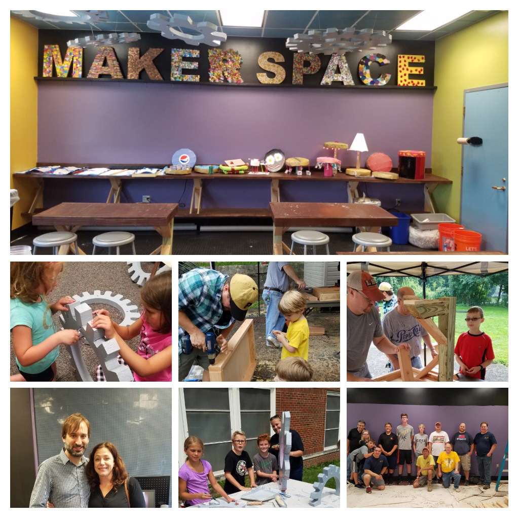
Ta-da!
SO much fun. Best project ever. And, believe it or not, ALL DONE!!
Then, the high school calls. They need an innovation space.
TO BE CONTINUED....
YOU CAN'T HAVE IT ALL
I just love this little animation. If I had a nickel for every time I've tried explaining this, I would have, like, $3.55.

FONT SMATTER
There is a new family Chiropractic business going in near my house. The first thing they did was install their sign, which is smart. Good to get people thinking about them, and familiar with the location as they build their new office space. It's mostly a nice sign. Well constructed. Decent size. But something about it is a bit problematic. I drove by it at least four times before I realized what it really said. At first I thought, surely, that family name is short for something? I've never in all my days heard of a name like that. And even if it WERE your last name, wouldn't you maybe consider an alternate name for your business? (Unless you were a Gastroenterologist or maybe a Proctologist? Or a Doggie doo-doo clean-up service?) Anyways. My point is, fonts are important, people. You really need to think about them. Consider readability, usage, scale, placement, as well as "I just like the way it looks". (Also, are they a family of Chiropractors or are they a family practice? I'm still confused.)

"Can anyone recommend a good Chiropractor?"
"Oh, I truly can't say enough about the Turd Family. They are a solid practice. You gotta go."
IT'S ABOUT DARN TIME
Well, it's been over a year since I last posted. I'm going to say it's because I have been so busy with client work that I just couldn't find the time for my own brand. And I know you will believe that because I am so selfless and dedicated.
Anyway, what better reason to get back to posting than the biggest news of 2017. I mean, it's been all over the media. And it's color related. No, no, no. Not orange. GREEN!!!! And not only green, but Yellow Based Green! YES. Greenery is the Pantone Color of the Year 2017. YAY!!! It's about darn time. I've loved green, and especially yellow-green my whole life, and I will tell you one thing, I get A LOT of flack for it. "Goat's Puke Green". "Bile Green". "Baby Poop Green". Trust me, I've heard it all. Many people are so not down with my go-to hue. But I have stood by it forever, and now my friends, I reap my reward.
So today, more than ever, I am here for all your fresh, new, and vibrant YBG needs. Leaves, lima beans, golf courses, unripened tomatoes, tree frogs, bile. It's all here for you. And I'll put them in any form - digital, motion, logo, vehicle graphic - you name it.
I'll even pair it with other colors. Except orange. It's just too soon.

Just look at all the things that can be Yellow Based Green: 1) A lumpy Kleenex box cover with no hole for getting the Kleenex out.. 2) One of those light bulbs that's hard to look at or it gets burned into your retinas for a half an hour. 3) Wine glasses for drinking flights of wine while you are watching The Crown. 4) One of those toys that your kids beg for and then never look at again once they get it home but you save it for 10 years anyway. 5) A large open mouth without any eyes. 6) An extra arm with a magnifying glass and a light on the end for seeing stuff when you are over 40. 7) A nice basket for cats to sleep in. 8) The Holy Grail. 9) A super special thing to drink wine out of when you are in need of a lot of wine at once. 10) A chair that would last about 45 minutes in my house before someone totally destroyed it and then my husband would have a nervous breakdown.
HOLIDAY HOUSE TOUR
If you're looking for something super festive to do in Pittsburgh this weekend, check out Christmas in Ben Avon: Holiday House Tour on Saturday, December 5th, 10 am - 4 pm or 6 pm - 9 pm. There are seven fantastic buildings featured including the tour highlight, a beautifully restored former Friary that now houses advertising agency, Nium. Proceeds benefit Avon Club Foundation.
Many moons ago, I created the poster for the tour (note the liberal use of yellow based green), and this year I'm going to be a docent. So stop by 7001 Ohio River Blvd from 10 am - 1 pm and say hi!
For more information take a look at this Post Gazette article or the Ben Avon Club website.
FILM FOLLIES 1991
I just recently converted a small pile of ancient VHS tapes to digital (to the great dismay of some people and the moderate delight of others). One tape in particular personally delights me the most. It's a group senior project I worked on at Penn State, and it's called Film Follies - a collection of film shorts and slide shows that the PSU graphic design program has been producing for 40 years.
We were slightly less than high tech in 1991. We actually made slide shows with slides that we sent away to be developed and waited around for and then projected with actual slide projectors that overheated a lot. We used reel-to-reel projectors to play film leader that we animated by hand by scratching into and/or drawing on it. When our ancient projector equipment failed to work, and we called our professor to complain about it, he hung up on us. You know, it was just pretty much way old school all around.
One designer in my class, Wendy Miller, had the presence of mind to video tape the show - she actually set up a camera in the back of the room and shot it and then handed everyone in the class a VHS tape. The result was considered nothing short of fantastically awesome at the time, and is now viewed as basically a hot mushy mess by today's hi-def standards. But, nonetheless, I love this little relic. The music alone makes me smile. Especially because we eventually chopped up our films and put the pieces into our physical and ginormous portfolios (that we CARRIED AROUND BY HAND AND SHOWED TO PEOPLE IN PERSON). So, they no longer exist. Except in this time-capsule format.
Anyway, it's quite long, and quite dark. But I know a few people who will delight in it (and feel a bit of dismay over it) just as much as I do.
Ladies and Gentlemen, without further adieu, presenting: FILM FOLLIES 1991. Enjoy.
WHEN YOU PLANT CORN, YOU GET CORN
It's been a while since I've posted a blog entry. I suppose Mother's Day is a weird day to be posting a to my work blog, but I want to share the lovely YellowBasedGreen branded Mother's Day card my daughter, Mia, made for me this year. My husband majored in music and I in art, so our kids are 'shockingly' pretty creative. Mia's teachers like to take me aside and tell me how artistic she is. And I like to yell, "Nooooooo! Nooooooo! Don't let her draw! There's no telling where this drawing could lead! Drawing is the gateway to graphic design!!" Anyway, it seems that the old saying is true. When you plant corn, you should not be surprised to find corn growing - we are arty people and we have created two more arty people. And in this case, an art person with a real gift for self promotion! What a wonderful combo! Note the details of the card below: YellowBasedGreen logo and name, the obligatory Happy Mother's Day type (in my second favorite color), beautiful flowers and hearts, and she says she loves to see me smile. So nice! But, if you look carefully, you'll see my favorite line of all on the lower right. So much for unconditional love from a 10 year-old. Happy Mother's Day everyone!
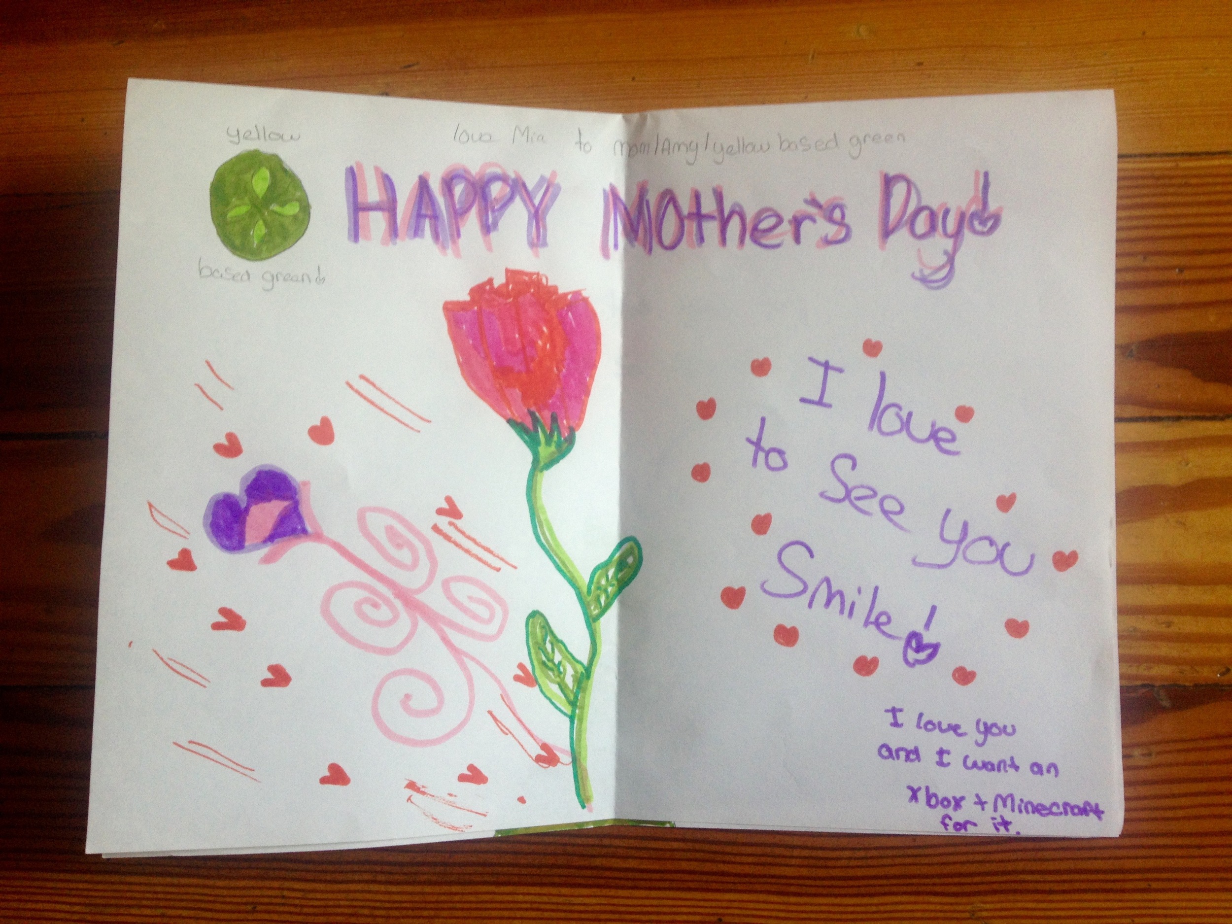
She loves me. And. She wants an Xbox and Minecraft for it.
WHEN WORLDS COLLIDE
Ah, 2014 was quite a year. Two particularly notable events were: 1) adopting a cat named Steve and 2) creating a website and a series of testimonial videos for Lifeline Physical Therapy and Pulmonary Rehab.
Little did I know how these two events would come together.
I have been working with Lifeline for two years. I've created an array of marketing materials for them and was incredibly impressed with the glowing feedback I heard about Lifeline when I did patient interviews for videos that were created last summer.
I have known Steve since March. We were introduced at the Humane Society, and and I've been incredibly impressed with his speed, dexterity, and general insanity.
In November, as my husband, Mike, was chasing Steve the "indoor" cat (who was chasing a rabbit) around our backyard, Mike injured his knee. Bad. Yes, he sprained his medial collateral ligament and had a bucket handle tear in his meniscus. (Who knew anyone even had a medial collateral ligament??) So, he saw a doctor, and was scheduled for surgery, and proceeded to lie around and whine. Then it hit me, my golly, he should go to Lifeline for Physical Therapy. I hear they are good. His doctor agreed that "shaking his knee around a bit" might be effective so Mike started PT at Lifeline in Forest Hills. As much as Mike wanted to avoid surgery, he was skeptical. After all, he was not completely cured after his very first appointment.
But, even after that very first appointment, he felt a bit better. (I even noticed he was a tad less whiny.) And then slowly but surely, his knee wasn't just a little better, it was A LOT better. So much better, in fact, that his shocked surgeon declared he no longer needed surgery. In fact, after two months of therapy, Mike has graduated from Lifeline and is good as new. (Except for stabbing himself in the right eye with a tree branch. But that's a story for another blog entry.)
Although I would have preferred to simply trust the patient testimonials, it was great to discover first hand how amazing the therapy at Lifeline truly is. I was blown away by the treatment Mike received from everyone at Lifeline, particularly Physical Therapist, Dr. Jeanette Kochman.
Steve is largely unimpressed with both the Lifeline testimonial videos and with Mike's miraculous recovery.
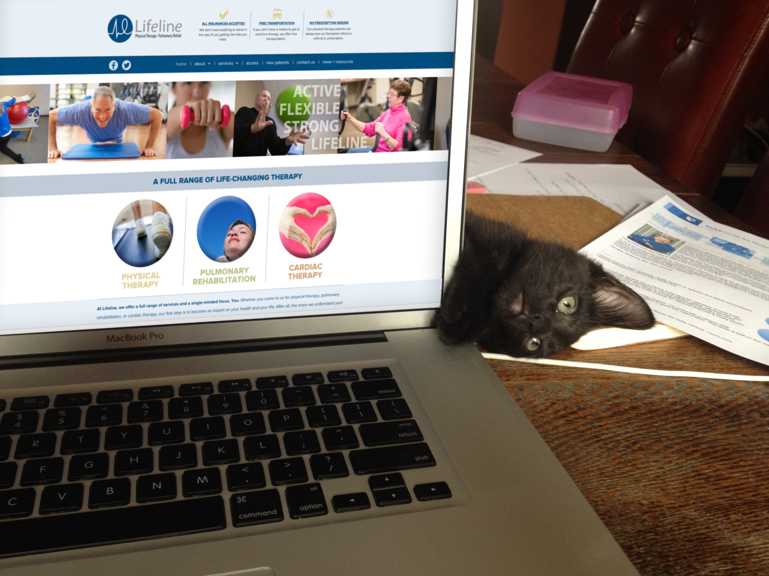
Steve actively cultivating his sense of ennui.
Source: http://www.yellowbasedgreen.com
I COULD HAVE BEEN A FEDERAL AGENT
I was recently asked to fill out a questionnaire as a class assignment for an aspiring art director. After writing and sending what became a fairly lengthy diatribe, I discovered the student is actually interested in being a film art director. Not an advertising art director. Oh well. It makes a nice blog entry.
- When you were younger, what did you hope to be?
If I hadn’t gotten into the graphic design program at Penn State, my backup choice of major was Administration of Justice so I could be an FBI agent. Anyone who knows me finds this quite hilarious. - What did you study in college?
I got a BA with an emphasis in Graphic Design. - How long did it take to become an art director? Describe the process.
The design program at Penn State prepared me for a career in advertising without actually teaching advertising. The program is heavily concept based, and by learning how to solve a wide variety of design problems, I was able to seamlessly transfer what I learned about graphic design to an ad career. I graduated in 1991 during the a Gulf War recession. No one was hiring. Over a period of three months, I had close to 50 interviews in Erie, Cleveland and Pittsburgh before I was mercifully hired by Dymun Nelson, a great, small boutique agency in Pittsburgh. Good thing, too because my dad had forced me to apply at Red Lobster – they called the same day I was hired at Dymun and I had the pleasure of telling them I had accepted employment elsewhere. - Describe a normal day as an art director.
There really is no such thing as a “normal” day in art direction. I worked at a variety of agencies for 21 years then, three years ago, I decided to go full time freelance. I work from home in my dining room office. As a freelancer, I’ve done everything from TV to logos to trade show booths to Prezi presentations to corporate videos, to signage, outdoor, packaging and web sites. The only thing predictable about this business is that it’s not at all predictable, and that can be overwhelming. Thankfully, there is a common thread to it all, and that thread is ideas. There is comfort for me in knowing that no matter what the type or size problem, no matter what media is used, no matter how fast technology changes, no matter that no day is “normal”, all problems can be solved with an idea. - Name one thing you enjoy about your job. Describe.
The chaos. This job is totally different every day. You never know what could happen next. - Name one thing you don’t enjoy. Describe.
The chaos. This job is totally different every day. You never know what could happen next. - Would you recommend the career path?
Absolutely. You can dress however you want and swear at work. But it’s not for everybody - I’ve had advertising interns leave for lunch and never come back. Art direction is incredible, but it’s insanely intense and demanding. It looks like great fun from the outside, but it’s often stressful to the point that I wonder if I shouldn’t have maybe just gone into the FBI after all. (Air traffic control? Bomb squad? Emergency medicine? At least those fields actually LOOK like work.) - Do you have any advice for an aspiring art director
Don’t be an art director if you don’t love it. And not just love it, be willing to eat sleep and breathe it. Go to a good school that teaches you to think. Make a killer portfolio. Don’t put more than 20 pieces in it and don’t put anything in it that you have to apologize for. Contrary to popular belief, you do not have to stay up all night to create good work. You will, however, put in lots of long hours. Spell check. Call all the phone numbers and double check all the email addresses. Be good to young account executives – they will all be your clients one day. Crying is okay but try to do it in the bathroom. Fear is okay too (blank pieces of paper and blank computer screens can be terrifying), but use fear to motivate yourself, don’t let it paralyze you. Learn from your writers. You’ll be a creative director one day and you will need to know how to write, or at least fake it well enough until you can get to a real writer. Be nice to people. Be especially nice to your vendors – they will work twice as hard if you are nice and ad photographers make great wedding and family portrait photographers later on. A computer is just a tool – it won’t think for you. Stand up for yourself – don’t be a pushover. The business world is rough. Know who you are and what you are willing to do and not do and don’t compromise your ethics. Know what your strengths are – no point in working forever at a place that specializes in annual reports if your passion is broadcast, but do try everything once. Don’t use ellipses, go easy on the exclamation points. Kern. Practice, practice, practice your presentations. Then practice them again. Sometimes the best learning experiences are learning not what you want but what you DON’T want. You will get laid off, or fired. At least once – don’t let it kill you. Don’t let any ad agency define you – if you are truly unhappy, quit and go work somewhere else. Ask for raises and promotions when you know you are ready – no one will ask for them for you. Feel free to pat yourself on the back if you’ve done a great job and no one seems to notice. Be yourself. Try not to gossip. Vent appropriately. Listen – it’s hard to learn when you are talking. Ask questions. Lots of them. Never walk away from a photo shoot or a press check or input meeting with questions in your mind. Demand creative briefs or write them yourself – you can’t solve a problem until you define it. Make lists – the work piles up fast and you will lose track of what is due when. Read – stay current on award-winning work. Work you ass off, entrench yourself in assignments, but know when to get up and walk away for a while. The best ideas come when you are actively not thinking about them. If you ever get the chance to work with an account planner, get to know that person really well. They are some of the smartest people in the business. Don’t give clients what they want, give them what they need. Go to happy hour. Remember there is no such thing as an advertising emergency – life is plenty full of emergencies and advertising doesn’t qualify. Mostly, have fun. No reason to be an art director, or anything for that matter, if you don’t enjoy it.
I HEART OITNB
My name is Amy and I love the Netflix series about life in a female prison, Orange is the New Black. In fact you could say I have a OITNB binge watching “problem”.
I admit it. I watch it so fast and so voriaciously, that I start to loose touch with reality and feel like my house is a prison. (Wait, maybe that’s just a freelance problem?) Anyway, imagine my surprise when halfway through season two, I noticed a campaign idea I worked on to market the city of Pittsburgh was featured in a scene on the show. I mean, when I saw it, I was so freaked out that I almost spit Pinot Grigio all over my foot rest.
The campaign idea is featured as a poster on the wall of a scene shot in the Pittsburgh airport. The scene is part of a character’s backstory, and features a snoozing airport employee asleep on the job. The visual idea of the Pittsburgh ad campaign is all about juxtaposition, and the contrast created on the TV show between the headline on the poster and the employee is hilarious. At least I think so. (After all, I have lost touch with reality.)
Anyway, I didn’t create that actual poster, but I was very excited that the campaign is still alive in any form - and especially a form that just happens to be on an award winning Netfilx series. That, as I have mentioned, I love.
Check out the Pittsburgh campaign I helped create for the Allegheny Conference on Community Development here. And, of course, check out OITNB on Netflix.
LANNY SOMMESE
I'll never forget my first lesson from Penn State Graphic design professor, Lanny Sommese. He drew a circle on the chalkboard and asked us all what it was. "Um, it's a uh, a circle?" someone in my class dared to answer. "Yes! It is a circle!" he said.
Then he wrote the word "Goodyear" under the circle. "What is it now?" He asked. "A blimp? "A tire!" we answered. "Right again!" He said.
He proceeded to jot various words under that circle. He wrote rising sun, and we said, "Japanese flag!" He wrote coffee and we yelled, "A cup! From above!"
And so went my very first lesson in Visual Verbal Closure: when pictures and words come together in different ways, they create different meaning. It was an absolute revelation. I was so darn excited. I don't think any single class in all my years of school had as much impact on me as that one. "What a great start to an awesome year of graphic design", I thought. I mean, Lanny Sommese is a design legend, and he had quite the reputation for being a real son-of-a-gun, but I remember thinking, "Aw, hey, he's not so bad."
Boy was I wrong. Starting in our very next class, I found out just how bad he could be. We presented our very first assignment. A slide show. He yelled. He screamed. He made fun of us. He had strong coffee breath. Later, he even poured coffee all over our assignments just to teach us a lesson on ephemera.
I was terrified of that man. And soon I hated him terribly.
A few weeks after that first class, when photos of Lanny were passed out to all the students so we could decorate them for a birthday surprise, I remember no one having a hard time deciding what to do. We gave him devil horns. We tied him up. Stuck X-Acto blades in his eyes. Clearly I wasn't the only one having "Lanny issues".
But, as the year went on, and my design work started to get better, I started looking at Lanny a little differently. He was a drill sergeant, all right. And what art major signs up for a drill sergeant?? But really, when you think about it, what art major doesn't need a drill sergeant? Especially an art major that, in a few short months, would be running headfirst into the industrial fan blades of the Advertising Industry.
Nine verrrrrrry long months after Lanny first drew that circle on the blackboard, I graduated. And by then, not only did I not hate Lanny, I was a little in love with him – with him, with my entire design class, with the graphic design world as a whole. Yes, I was high on Visual Verbal Closure. But as dreamy and idealistic as I was, I was also very green, and terrified of starting my new career. Thankfully, as scary as entry into the real world was, the one thing I wasn't was unprepared. In his unique way, and without me realizing it, Lanny had prepared me for exacting bosses, for demanding clients, for difficult problems, for astonishing solutions, for yelling, for screaming. For crying. For fun. For excitement. For all sorts of innuendo. For total abject humiliation. Yes, Lanny had prepared me for the ad biz.
I was ready.
I kept one of those weird black and white photos of Lanny that were passed out 24 years ago in celebration of his birthday (I even kept one that was free and clean of X-Acto blades). I've kept it in my office for all this time so he can watch me – keep me in line. And now that I am a freelancer, working from home, he's somehow wormed his way in with all my framed family photos. After years of working in agencies I was a little afraid of going out on my own. But there Lanny sat. In my dining room office, smiling at me among all the people who mean the most to me in my life. He reminded me that I was prepared.
I was ready.
I've had a great 24 year career in advertising, and have been successfully freelancing for three of those years. And this fall, after a zillion years of teaching, Lanny is retiring. So when I was asked to create a retirement gift for him, of course my first thought was, "No. HELL no!! No way I'm putting myself though another Penn State graphic design assignment. I can't do it! No one can make me! I'm absolutely not going to do it." Then I looked up at Lanny's smiling photo and thought, "Oh, what the heck. Yes I am."
I was ready.
Lanny Sommese is retiring from teaching this year. All his students were asked to create an 11" x 11" piece about what he has left us, now that he is leaving. This is the front and back of mine.